Thursday, July 08, 2010

100% Renewables With Energy To Spare

Regular readers have experienced my fondness for graphics - and won't be surprised that i liked this one. It comes from Zero Carbon Australia, who's plan for Australia to be on 100% renewable power i have mentioned before.


The orange and blue in the bottom represent the solar and wind power that would meet Australia's demand for electricity. The small bits of green and navy are the occassions where biomass and hydroelectricity would make up the shortfall, and the light orange/yellow at the top represents the massive amount of excess energy that would be produced.

So much for that theory that renewables can't provide our energy!

Wednesday, July 07, 2010

State Of Origin Score

As we go into game 3 of rugby league's State of Origin contest, it seems that Queensland dominate almost as much on the renewable energy scoreboard.


This is the percent of Queensland and New South Wales households that choose greenpower (renewable energy) from their electricity company.

Of course if this is the score in the rugby league state of origin, that would also be fine with me. :)
-----------------
(PS: Yes NSW fans, i know i do this at every state of origin. Perhaps i'll stop if ever NSW catches up ;)

Thursday, June 24, 2010

1 Day Of Driving

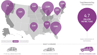
You know how i like a good graphic. Well the people at GE have put together an interactive display of America's car emissions for their recent Memorial Day holiday.


The encouraging bit is clicking on hybrid car or electric car and seeing the total emissions shrink. The discouraging bit is that one day's car emissions (right of screen) are equal to the total annual emissions of some smaller countries.

Monday, June 21, 2010

Solar Panel Heat-Map

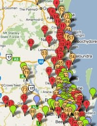
According to Energex, the are 19,982 dwellings with solar panels (in South East Queensland) which totals up to 33,109 kW of power.


Adjusted for the number of households, the above map shows the uptake of solar power. It ranks the postcodes by kilowatts of solar power per household. The top 50 postcodes are coloured red - the next fifty orange, then green then blue.

If you click through to the map, there is also a rankings list, so you can see exactly where your neighbourhood comes in.

Thursday, June 17, 2010

Solar Savings

Previously, i showed a graph of how much solar panels can save you each year - depending on much energy you use yourself - and how much excess you produce. In my latest bill from Origin, they did some calculations based on a home using 50% of the energy from the panels.


Of course, often the major energy use is outside of the main sunshine hours, so it is possible to sell back more than 50% of the solar energy to the grid - and take even greater advantage of the Solar Bonus Scheme.

(Oh, and the 50c/kWh in the calculation is Origin's special offer. The guaranteed rate set by the government is 44c/kWh. How nice of Origin :)

Thursday, June 10, 2010

New Jobs Map

A few weeks ago, i wrote about the Creating Jobs Cutting Pollution report - showing that the stronger the action from government to reduce emissions, the more jobs that are created.


Since then, the talented graphics people at ACF have put this information into a far more fun and colourful form - an interactive map. Try it out!

Wednesday, June 09, 2010

Living In Denial

New Scientist magazine has just done a special on Living in Denial. It's not exclusively about climate change denial - it also refers to vaccines, evolution, and smoking-induced cancer.


It includes articles on the difference between scepticism and denial, why sensible people reject the truth and how corporations manufacture doubt. It's an interesting read.

Tuesday, June 08, 2010

Crude

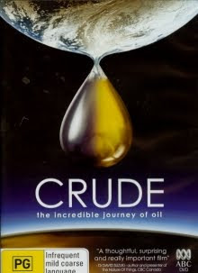
This DVD documentary Crude begins by explaining how oil got to be there in the first place (starting around 160 million years ago) and how much we have become addicted to it (and not just for motoring).


Consuming it at a rate of 84 million barrels per day, "we're all of a sudden dependent on rapidly shrinking supplies of evermore expensive oil"

It's tempting to think that perhaps running out of the stuff might save us from climate change, but Jeremy Leggett does the maths...
The latest work of the climate scientists says we can "afford" to put into the atmosphere another 400 billion tonnes of carbon. Well, you just look at what's left in fossil fuel reserves below ground. You've got 700-plus in oil alone. Then you've got 500 billion in gas. And coal - forget it - it's 3500 billion and counting. So we can cook our planet many times over

Having switched from exploration geology to a solar company, he explains that
My abiding fear is that i'll live through what remains of my vocational life in an exciting fast-growing company while the world is going to hell in a bucket because of the stupid addiction to oil we've had all these years and the effect that it will ultimately have on our economies ... plus of course, the unfolding effects of global warming, which just get worse by the month.

The DVD ends with this
Every year we burn more and more of what we have less and less of. Are we mining the aftermath of past climate catastrophes, simply to engineer our own?

Monday, June 07, 2010

Office Recycling

At a meeting in the city last week i spotted these great office recycle bins.


As well as tiny knee-high ones (suitable for seated office areas) they also had waist-high ones convenient for standing areas like kitchens, photocopy areas - or corridors (as demonstrated by Stuart).


Being a government building, i'm sure they were also there to promote the state government's Do The Right Thing initiative, which (among other things) lends recycling facilities for events and festivals.

I've mentioned before that recycling one aluminium can saves enough energy to power a TV for 3 hours. Now i find out that recycling one plastic bottle saves enough energy to power a light bulb for 30 hours. Wow!

Wednesday, June 02, 2010

European 30

I read today (in The Times) that the European Union is planning to up its greenhouse gas reduction target.

Prior to Copenhagen, they committed to at least 20% by 2020 no matter what. Now they are looking at upping that to 30%. Meanwhile Australia is willing to do maybe 5% - but won't even start until 2013.

Monday, May 31, 2010

A Tale Of Two Provinces

My Canadian friend recently passed me an article from her local paper 'back home' - figuring i'd be interested in the climate change coverage.

The piece covered the views of a political party leader in Alberta. I could say a lot of negative stuff about it, but one positive was that it gave a good example of how a province (or country) can choose its own destiny.


The other half of the example is provided by Ontario - who seem to be enthusiastically moving forward into the new energy economy. Solar energy in south east Ontario has the potential to match all the USA's nuclear generators combined. So the province is offering a generous feed-in tariff to encourage rooftop solar, and has announced 2500 MW of projects. Meanwhile, the Ontario Solar Academy has had to move to a larger facility to meet demand, as it triples its training capacity.

Meanwhile Alberta, despite huge potential for geothermal energy, appears to show little interest in changing its ways.
---
Update: 8000 MW of Solar Applications

Tuesday, May 25, 2010

DIY Home Energy Audits

In the USA, they don't have the free home sustainability assessments that we have in Australia. So David Findley has written this guide for doing your own home energy audit.


During the book he lists 140 tips for saving energy and increasing efficiency. A lot of them are to do with heating and cooling (because that's a huge percentage of energy use in North America). It's a reasonable book, but if you're in Australia, i'd still recommended the free home sustainability assessments funded by the government.

Monday, May 24, 2010

Carbon-Friendly Coach

Very good friend of mine is planning a trip by coach, and tells me that greyhound will offset the travel emissions for just $1 extra on the ticket. So i checked it out.


I was impressed by the offsets because it takes the form of emission prevention - which i think is even better that tree-planting. But also, the greyhound buses run on the cleanest diesel available in Australia, and have upgraded their fleet of buses for fuel efficiency (which i'm sure also saves them buckets of money in fuel costs). I was suitably impressed.

Of course, all of this comes on top of the stat that coach travel is already 80% less polluting than car travel.

Thursday, May 20, 2010

Creating Jobs - Cutting Pollution

I see that the report Creating Jobs - Cutting Pollution has been released. Some still think these are opposites, but the report shows differently. It compares 'weak action' (just an emissions trading scheme) to 'strong action' - an ETS plus initiatives like energy efficiency, investment in renewable energy, fuel efficiency and public transport.


Strong action increases GDP by 3.2% per year (weak action 2.8%) and strong action creates 770,000 more jobs than weak action (which creates more jobs than taking no action). Strong action also means less imported oil ($181 billion) and efficiency savings ($53 billion for households alone).

Don Henry remarked that Australia’s transition to a cleaner economy was being held back by government policies. "In this election year Australians want our leaders to show they have got a serious plan to shift us to a cleaner economy with new industries and better jobs."

Wednesday, May 19, 2010

Blocks Of Ice

Recently i linked to a Catalyst report - which mentioned the increase in Antarctic ice melt from 75 to 150 billion tonnes per year. Sometimes it's hard to imagine what that much ice looks like. Fortunately, John Cook's visualisation of the Greenland ice melt helps us get the picture.

With the Empire State Building for scale, this is 1 billion tonnes of ice.

Greenland ice melt 2002-03: 139 billion tonnes
Greenland ice melt 2008-09: 286 billion tonnes