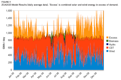
The orange and blue in the bottom represent the solar and wind power that would meet Australia's demand for electricity. The small bits of green and navy are the occassions where biomass and hydroelectricity would make up the shortfall, and the light orange/yellow at the top represents the massive amount of excess energy that would be produced.
So much for that theory that renewables can't provide our energy!
No comments:
Post a Comment