This
interactive map comes from the people at Chartsbin, and illustrates the per-person emissions of each country - from the burning of fossil fuels (with heavy shading indicating high polluting)
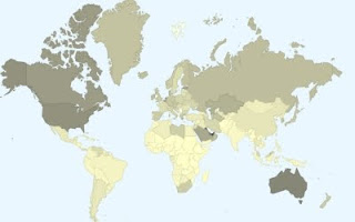
Hovering over each country on
the map, displays that country's emissions. For the record, Australia's pollutes at about 5 times the world average.
No comments:
Post a Comment