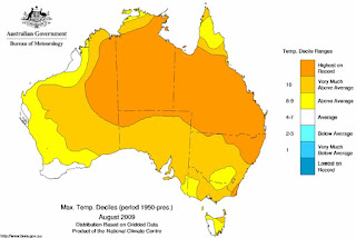
 Yellow and orange mean warmer than average. Deep orange indicates record temperature. White is average, and (if you can see any) blue means cooler than average.
Of course, one month doesn't mean that much. But then i found this graph of the number of extreme months over the decades. (red for hot months, blue for cold)

One hot day doesn't mean global warming, but when it's hot everywhere - and more and more frequently - that's the concern.
No comments:
Post a Comment